Graphical Representation
LabVIEW is renowned for its effective graphical data display capabilities. It offers an extensive range of controls and functions, greatly simplifying the task of graphically representing data. The Graph control palette in LabVIEW showcases a variety of controls, each designed for specific data types. However, it's interesting to note that many controls on the palette are essentially variations of the same control, differentiated primarily by the additional code they add to the VI's block diagram when placed on the front panel.
For example, an image control can adeptly display data in both Cartesian and Polar coordinate systems. Yet, a control designed for Cartesian coordinates might come with different accompanying code compared to one for Polar coordinates. This distinct code, bundled with the controls, plays a crucial role in processing diverse data types. It ensures that the data is converted into a format that is compatible with the graphic controls, facilitating accurate and visually appealing data representation.
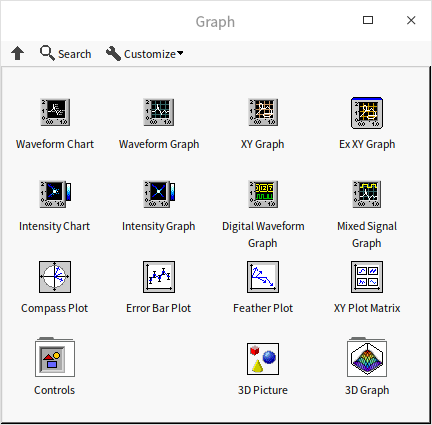
The majority of these controls are designed for 2D data representation, with some capable of handling 3D data as well.
Waveform Chart and Waveform Graph
Two of the most frequently used controls for displaying data curves in LabVIEW are the waveform chart and waveform graph controls. Curves, often referred to as waveforms, represent sets of numerical data evolving over time. In LabVIEW, the most typical curve format employs the X-axis to denote time and the Y-axis for data values, utilizing a Cartesian coordinate system. This approach is particularly effective in visualizing time-based data, making these controls essential for applications involving temporal data analysis.
Difference between Chart and Graph
In Graph control palette, you will find both Chart and Graph for Waveform and Intensity data. While their functions are quite similar, the primary distinction lies in how they handle and display data.
Chart controls come equipped with a built-in cache that stores historical data. When new data arrives, the chart doesn't discard the existing display. Instead, it integrates the new data with the pre-existing display. Charts are ideal for visualizing data that changes at a slower pace. For instance, if you have a program that monitors and displays boiler temperature data once every second, a waveform chart control would be appropriate. It not only shows current data but also provides a historical view, allowing users to observe temperature trends over time.
In contrast, waveform graph controls do not have a data cache. They refresh the display with each new data set, clearing previous graphics. Graphs are more suitable for illustrating high-speed, instantaneous data. For example, if a program collects 1000 vibration signal data points from an object within 0.01 seconds, displaying each point individually is unnecessary and impractical for human observation. The waveform graph control can effectively display all the data at once after the complete data set is collected.
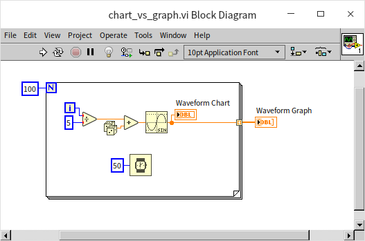
When a new waveform chart control is added to a VI's front panel, its corresponding data type in the block diagram is a double-precision floating-point (DBL) number. Conversely, adding a new waveform graph control results in a real number array data type in the block diagram.
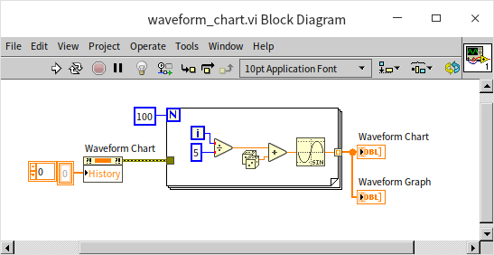
The terminal of a waveform chart control on the block diagram is usually incorporated within a loop, with each iteration providing a new data point to the chart. A waveform graph terminal, on the other hand, receives an entire set of data at once for display. The following program illustrates this difference. It generates a sine wave signal with noise and feeds the signal to both a waveform chart and a waveform graph control, albeit in different ways:
When you run the above VI, you'll notice that the final data curves displayed by both waveform chart and a waveform graph are identical. However, there is a distinct difference in their rendering processes during the VI execution: the Waveform Chart draws the curve progressively, plotting each point as the data comes in; while, the Waveform Graph waits until all the data is collected and then renders the entire curve in one go.
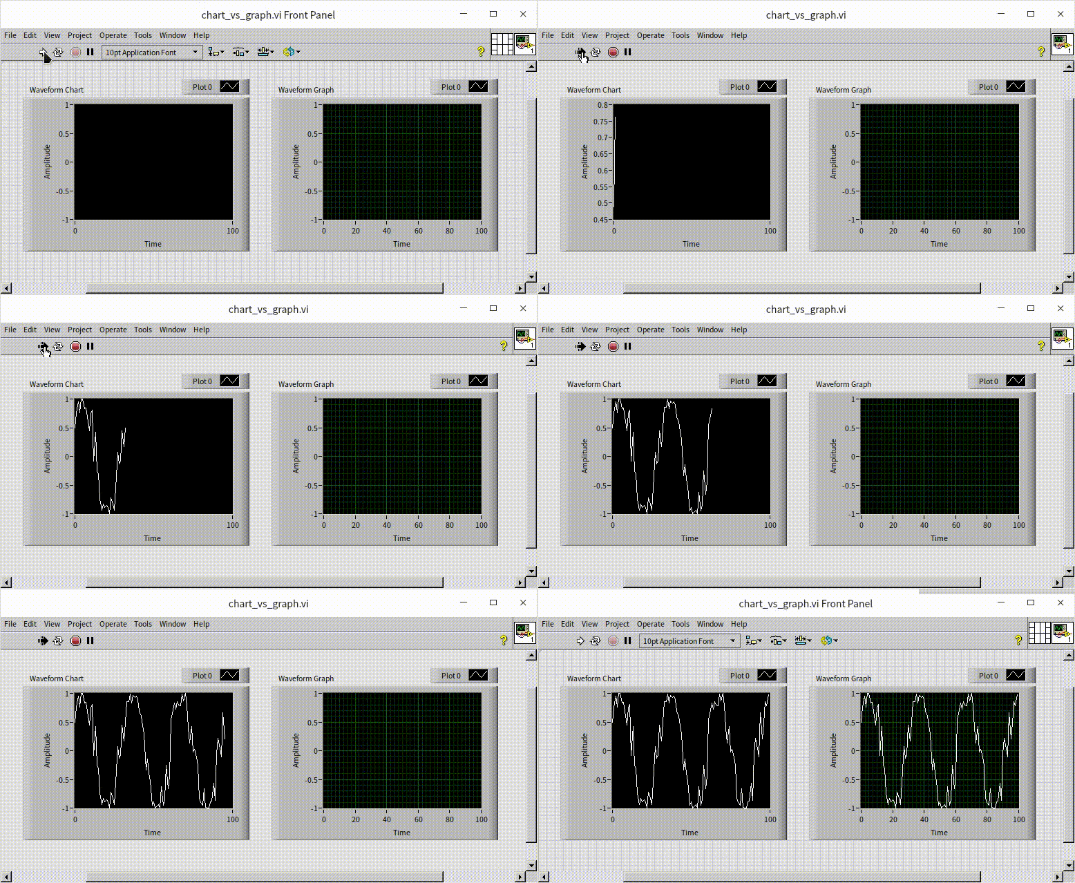
On subsequent runs of the VI, the waveform chart retains the previously plotted data, continuously appending new data points. To start each run afresh, you can clear its historical data using the "history" property node of the waveform chart. This approach ensures that each run begins with a clean slate:
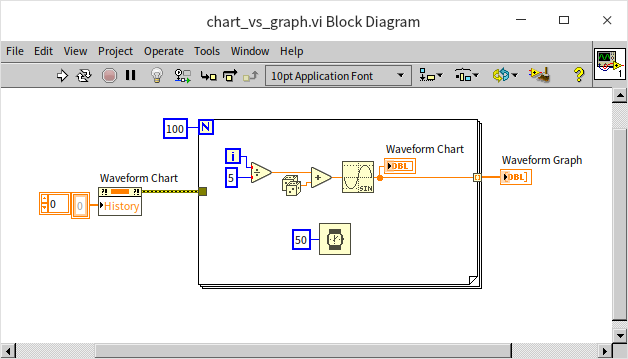
Additionally, this property node can be used during runtime to either clear the historical data of the waveform chart control or to set up initial historical data.
Unlike other controls we intrduced in previous chapters that typically correspond to a specific data type (e.g., switch controls for Boolean data, text box for string), waveform chart and graph controls are more versatile. Besides their default DBL and DBL array types, they can also accommodate various other data types, adapting their display methods accordingly.
For instance, waveform chart controls can also process numerical array data, adding all input data to the waveform display area simultaneously. Modifying our earlier example to pass the generated array data to both waveform chart and waveform graph controls outside the loop demonstrates that both controls exhibit identical behavior under these conditions:
Displaying Multiple Waveform Curves
Both waveform chart and waveform graph controls in LabVIEW are capable of displaying multiple waveform curves. A common approach is to use multi-dimensional arrays for this purpose. While a one-dimensional array can represent a single curve, a two-dimensional array can depict multiple curves. However, it's crucial to understand that the waveform chart and waveform graph controls interpret two-dimensional array data differently:
- Waveform Graph Control: In the 2D array data for this control, each row corresponds to a curve, and each column represents a data point at a specific time.
- Waveform Chart Control: Conversely, for the waveform chart control, each column represents a different curve, and each row denotes a data point at a particular time.
The example program below illustrates this concept. The waveform chart and waveform graph controls display identical curve patterns, but the input data for one is the transpose of the other:
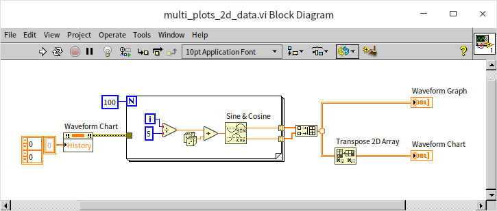
This distinction arises from the different use cases of these controls. The waveform graph control is designed to plot one curve at a time before proceeding to the next, while the waveform chart control plots data for all curves at a single time point before moving on to the next time point.
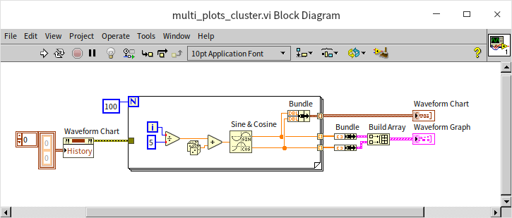
Another data type well-suited for waveform controls is the cluster array. The handling of cluster arrays follows similar rules to the two-dimensional arrays:
- Waveform Graph Control: Each cluster in the array represents a separate curve.
- Waveform Chart Control: Each cluster corresponds to data at a specific moment in time.
The program in the figure below yields the same result as the previous example but uses a cluster array to represent the data:
The waveform chart control in LabVIEW offers two distinct modes for displaying multiple curves: "Stack Plots" and "Overlay Plots".
- Overlay Plots: This is the default setting where multiple curves are superimposed on the same graph. It's useful for direct comparison of curves in a shared coordinate system.
- Stack Plots: In this mode, each curve is displayed in a separate mini-graph, which is particularly beneficial when curves vary significantly in their Y-axis range or offset, making it impractical to plot them on the same graph.
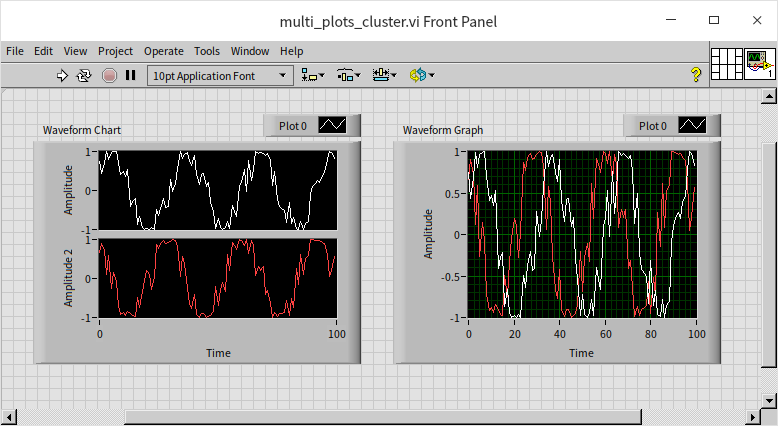
Consider a scenario where two curves exhibit a considerable difference in amplitude. Displaying them in the same coordinate system may obscure the details of the curve with a smaller amplitude, as shown below:
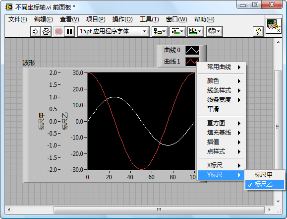
In such cases, stack mode becomes advantageous, allowing for individual display and clearer visualization of each curve. However, the waveform graph control lacks a stack mode. Alternatively, if you still prefer to display curves on the same graph for comparison in a waveform chart control, there's another solution: setting different coordinate systems for each curve.
By right-clicking on the scale of a waveform graph's coordinate axis and selecting "Copy Scale", you can introduce an additional scale to the graph. Each scale can have distinct settings. In the property dialog of the waveform graph or through the legend's right-click menu, you can specify which scale to apply to each curve. Utilizing different scales can enhance the clarity and effectiveness of each curve's display in the waveform graph:
Waveform Data Type
In many real-world applications, it's essential to represent not just the data values but also their corresponding actual time information. For instance, if data was collected between 9:01:01 and 9:01:02 on December 18, 2021, this specific time information is crucial for understanding the context of the data. To achieve this in LabVIEW, the time information and data values must be passed together to the waveform control. LabVIEW facilitates this through its predefined waveform data type, which is a specialized cluster designed to store waveform data along with time information.
The waveform data type encompasses four key elements:
- t0 (Start Time of Sampling): Represents the beginning time of the data collection.
- dt (Sampling Interval Time): Indicates the time interval between each data point.
- Y (Data Values): Contains the data, where each point in a one-dimensional array corresponds to a Y-axis value.
- Attributes: Holds additional attributes related to the waveform.
Given its comprehensive nature, the waveform data type is the preferred choice for representing collected data, especially when time information is a crucial component. Functions related to this data type can be found in the "Programming -> Waveform" section of the LabVIEW function palette.
Consider the following program that generates waveform data using the current system time as the starting point and a sampling interval of 0.1 seconds:
With time being an integral part of the waveform data, displaying this information on the X-axis of the waveform graph enhances the intuitiveness of the data representation. To achieve this, simply adjust the display format of the graph's horizontal axis. By right-clicking on the axis and selecting "Format", you can configure its display. This method aligns with the format setting approach used for standard numeric controls in LabVIEW. Opting for the "Absolute Time" format displays the time on the X-axis, or alternatively, you can choose a custom display format through advanced settings:
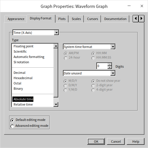
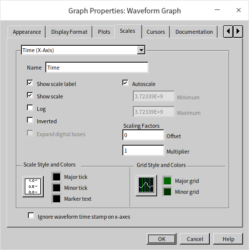
By default, the waveform graph control doesn't utilize the time information from waveform data for the X-axis. To incorporate this time data, you need to disable the "Ignore waveform timestamp on x-axes" option:
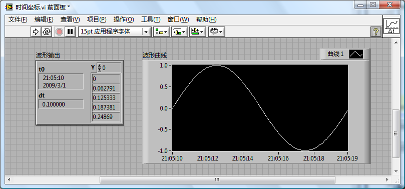
The resulting display, as shown in the program output below, presents the X-axis coordinates in a time format (hours:minutes:seconds):
The "Set Waveform Attribute" and "Get Waveform Attribute" functions enable you to access and manipulate attributes within waveform data. Waveform data can hold various attributes, including channel names, units, magnification factors, and other relevant collection information. This feature is particularly useful for preserving and passing such details to subsequent programs.
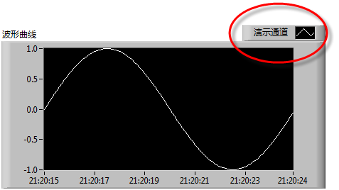
For instance, setting the "NI_ChannelName" attribute automatically updates the channel name displayed in the waveform graph. You can find more information on these specialized attributes in the help files of these functions:
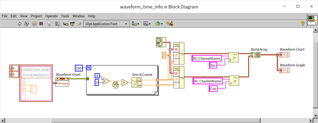
One significant advantage of using waveform data is the consistency it brings across different controls. Both waveform chart and waveform graph controls can accept the same waveform data format and display identical results. Consider the following program, which demonstrates this consistency:
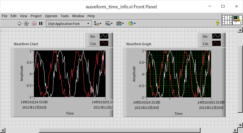
The outcome of running this program shows that both types of controls exhibit the same behavior with waveform data:
XY Graph
The waveform graph control typically handles data with a specific characteristic: the time signals are orderly and evenly spaced. For such data, a one-dimensional array often suffices to represent Y-axis values at each time point. When specific time data is also required, it's not necessary to store data for every single time point; instead, only an initial time value and a time interval value are needed.
However, beyond waveform curves, there are scenarios where curves of different types need to be plotted, where the X-axis values are neither orderly nor equidistant. In such cases, an additional array is required to represent the X-axis values for each data point. This type of data, comprising pairs of corresponding X and Y values, is best displayed using the XY graph control.
XY graphs are commonly used to demonstrate the relationship between two different data sets. These graphs have a wide range of applications across various fields. For instance, they are often utilized to display the correlation between data from two channels in a collected dataset. Additionally, XY graphs are used in showing the distribution of a specific feature within a dataset or the interrelationship between two features, particularly in fields like Data Statistics or Artificial Intelligence.
Displaying the Relationship Between Two Signal Channels
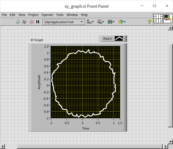
The following figure provides a straightforward demonstration, utilizing two sine waves with a 90-degree phase difference as inputs for the X and Y axes of the XY graph control:
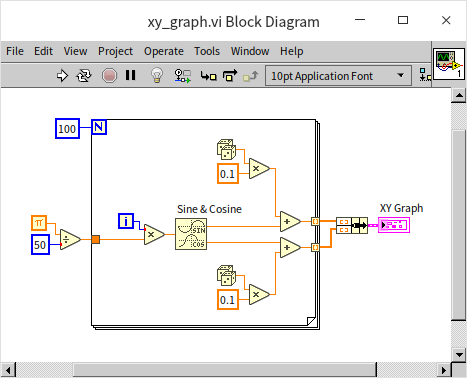
In the absence of noise, the resultant image would form a perfect circle. However, in the example, due to the introduction of some random noises, the XY graph control instead displays a circle characterized by uneven, serrated edges:
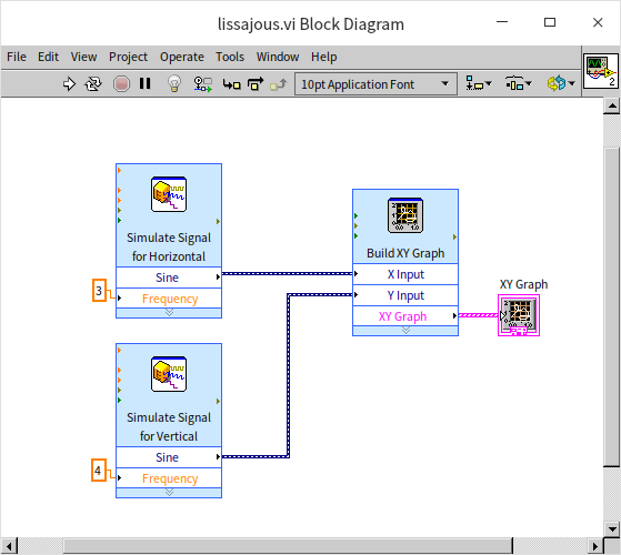
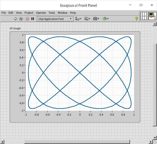
Lissajous curves, a common feature in many oscilloscopes, represent the path created by the combination of two sinusoidal oscillations moving in perpendicular directions. These curves, also known as Lissajous figures or Bowditch curves, can be employed to determine the frequency ratio and phase difference between two signals. In the depicted program, the XY graph control is used to draw Lissajous curves. This program is a simplified example, employing an Express VI to generate the required sine wave signals for the two channels, with frequencies of 3Hz and 4Hz respectively:
The resulting Lissajous curve for the input frequency ratio of 3/4 between the two sine signals is presented below:
Data Analysis
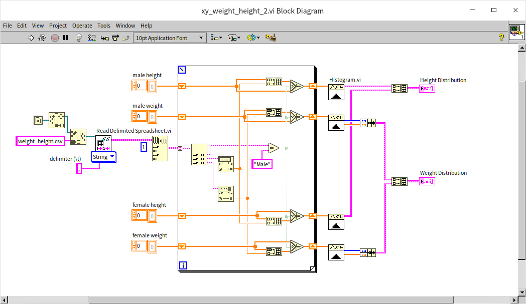
The "weight_height.csv" text file compiles the gender, height, and weight data of ten thousand individuals. To explore the potential correlation between height and weight, we utilize an XY graph control, plotting height on the X-axis and weight on the Y-axis. This approach allows us to visually examine the relationship between these two variables. Additionally, the XY graph control can handle multi-channel data, enabling us to segregate the data by gender into two distinct channels for men and women. Below is the program's block diagram for the example VI:
- The program initiates by reading the data from the csv file. It employs a library VI, "Read Delimited Spreadsheet", which is capable of reading tabular data in text format and outputting it as a two-dimensional array. For more information on file reading and writing techniques, please refer to the File Reading and Writing section.
- Subsequently, the program sorts the data into four one-dimensional arrays based on gender. These arrays represent male height, male weight, female height, and female weight.
- Finally, the data for men and women are separately channeled and displayed on the XY graph.
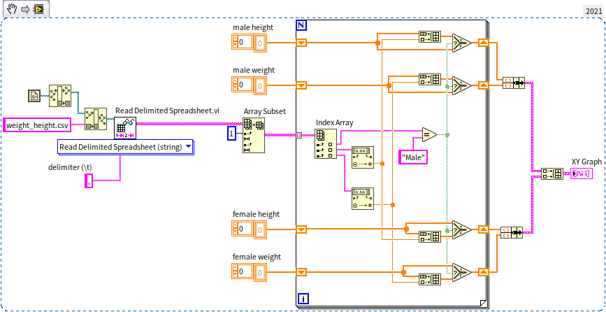
In this example, the data points are discrete, with each individual's data being independent. Hence, there is no necessity for connecting lines; we simply mark a point for each data set. The display style in the XY graph settings can be modified to show these as discrete points:
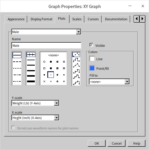
The program distinguishes male data with blue and female data with red. The following figure displays the outcome when the program is executed:
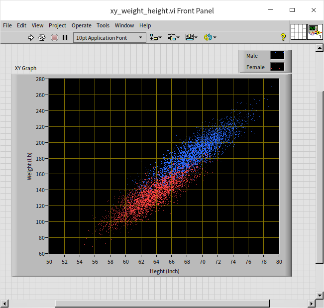
The data is conspicuously arrayed in a slender, slanted region. Observing the data for males, females, or as a whole, a significant positive correlation between height and weight is evident. For insights into the distribution of height and weight across the population, the XY graph control can also be utilized. The logic of this program is akin to the earlier example, with the difference being that the displayed data undergoes basic statistical processing. Here, height is used as the X-axis, and the number of people within each height range constitutes the Y-axis, illustrating the population's height distribution. Similarly, the distribution of people across various weight intervals can also be analyzed.
When examining data distributions along a specific dimension, bar charts are often employed, though line charts can be an alternative:
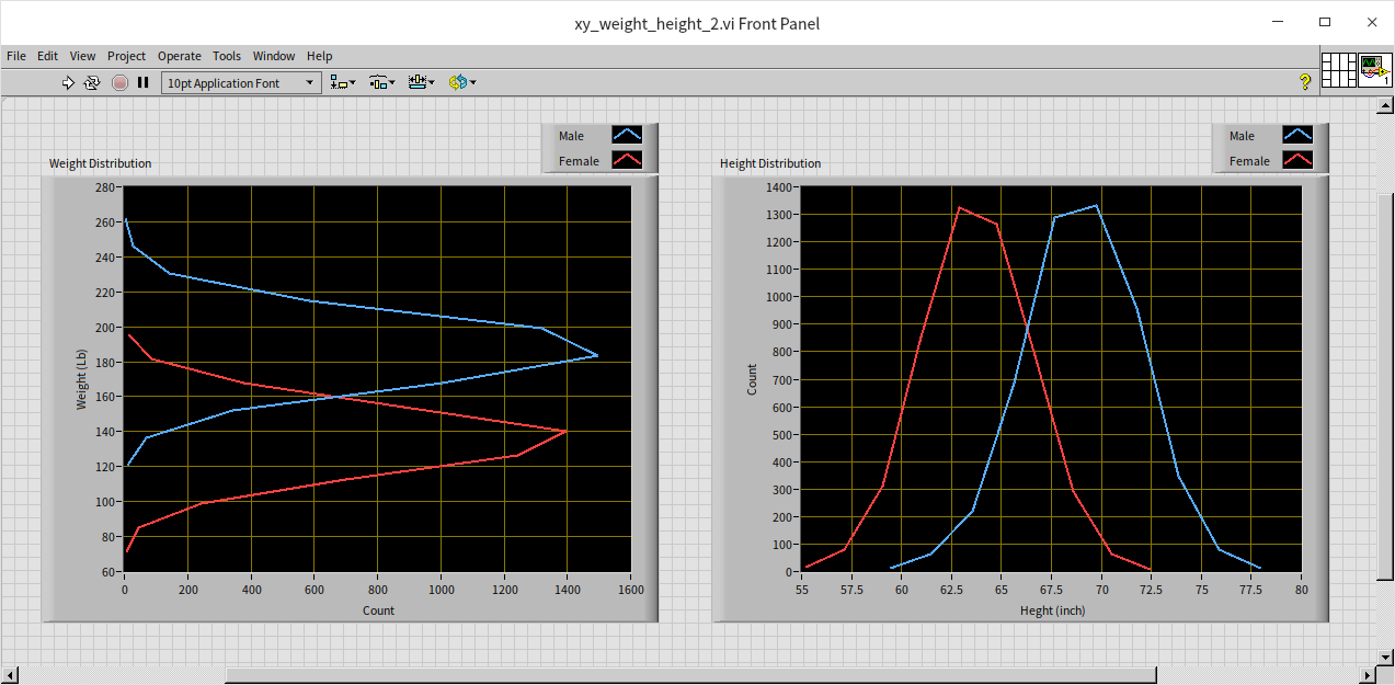
The data for men and women, while overlapping, shows a clear distinction in the peak areas (the most typical height and weight ranges).
Intensity Graph
Unlike the XY graph, which is limited to indicating the presence or absence of data at each coordinate point, intensity graphs allow for a more nuanced display of complex information. These graphs transcend two-dimensional constraints by incorporating a third dimension. In addition to the traditional X and Y axes, intensity graphs introduce a Z-axis value, enabling the representation of three-dimensional data. LabVIEW commonly adopts two approaches for displaying such data. While one method involves a three-dimensional graph control, we will focus on the alternative: using an intensity graph. This graph remains two-dimensional in layout, akin to the XY graph, but distinguishes itself by utilizing pixel brightness or color variations to signify the Z-axis values.
Time-Frequency Joint Spectrum Analysis
In measurement and control fields, waveform graphs typically convey two-dimensional data, with the horizontal axis representing time or frequency, and the vertical axis depicting amplitude or energy. However, more intricate analyses are often required. For instance, the energy of an actual signal may vary across frequencies over time. To visualize this variation, a graph capable of representing three-dimensional data is needed, segregating time, frequency, and power. The intensity graph meets this requirement by using color variations to signify the power dimension, alongside the conventional time and frequency axes. Some audio playback software features time-frequency joint analysis, displaying the distribution of sound energy across different times and frequencies. This functionality can also be achieved through LabVIEW programming. The figure below illustrates a program that performs this analysis. The methodology is relatively straightforward: the sound is segmented (e.g., into one-second intervals), followed by an analysis of the frequency-specific power distribution within each segment. The cumulative analysis of these segments yields a spectrum that evolves over time.
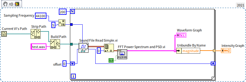
In the example program depicted above, there is a sub VI named "Sound File Read Simple.vi", easily identifiable by its icon featuring a pair of glasses and a note. In LabVIEW, the glasses symbol typically signifies data or file reading functionalities. This icon suggests that the VI is used for reading sound files, and it's found under the menu path "Programming -> Graphics and Sound -> Sound -> File". Another sub VI, labeled with the PS/PSD icon (FFT Power Spectrum and PSD.vi), located under "Programming -> Waveform -> Analog Waveform -> Waveform Measurement", employs fast Fourier transform to analyze the energy distribution in the frequency domain of a time domain signal, essentially calculating the power spectrum.
When determining the length of the time slice for analysis, it's crucial to strike a balance. If the time slice is too short, the frequency domain resolution of the time-frequency joint analysis result will be relatively low. Conversely, if the time slice is too long, the time domain resolution will decrease. These two resolutions are inversely related. Considering music and speech, which typically include four to five syllables per second, selecting a time slice of around 200 milliseconds is usually suitable.
The figure below shows a time-frequency energy spectrum of a piano piece. This visualization clearly depicts the distinct note changes within the piece. If one intends to write a program for converting music into a score, or for reconstructing telephone dial tones into actual numbers, the first step would involve performing a time-frequency joint analysis as described. Following this, one would identify the frequencies in the prominent spectrum segments and convert them into the corresponding musical notes or telephone digits.
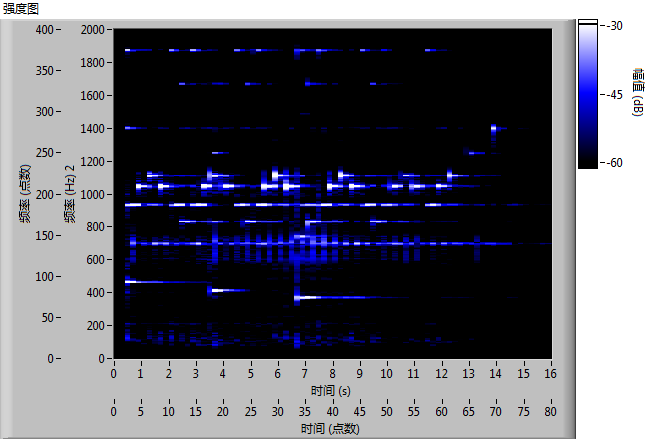
Modifying the program to source data from a sound card or other data acquisition devices enables real-time analysis of the captured signals.
Data Analysis
In the earlier example showcasing the distribution of height and weight, we utilized the XY graph to observe these parameters independently. However, to examine the joint distribution of height and weight simultaneously, a three-dimensional dataset is required: height, weight, and the distribution quantity. This complex interrelation can be effectively displayed using an intensity graph. The following program demonstrates this approach:
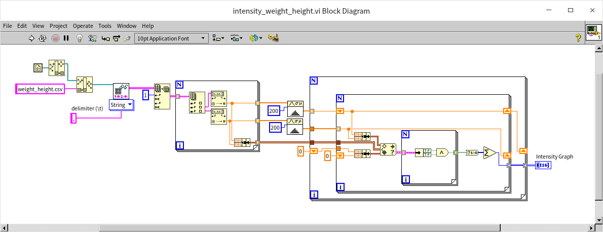
Due to the absence of a built-in LabVIEW VI specifically for creating a distribution map of two-dimensional data, this example program requires a more manual approach to compute the data distribution across various height and weight intervals. The solution involves dividing both height and weight into 200 segments, effectively creating a 200*200 grid. Each individual's data is then allocated to the corresponding grid cell. In the intensity graph, the brightness level represents the population count in each cell:
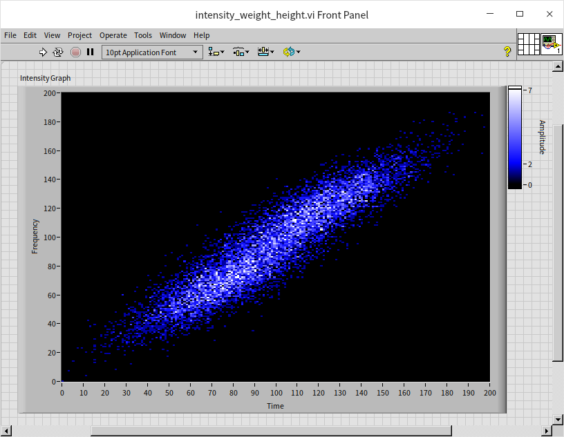
The resulting figure somewhat resembles a diagonally oriented galaxy. Notably, there are two regions with enhanced brightness, indicating the most common height and weight ranges for males and females.
Picture
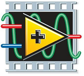
The display on a computer screen is fundamentally an intensity graph. For black and white displays, each pixel is represented by three-dimensional data: horizontal coordinates, vertical coordinates, and brightness levels. In color displays, this extends to an amalgamation of intensity graphs for red, green, and blue (RGB) color channels. Every image we see on the screen is, in essence, an intensity graph. Consequently, we can deconstruct an image into its fundamental brightness data and display it using LabVIEW's intensity graph control. The program depicted below reads an image file, specifically a LabVIEW icon. LabVIEW's image reading VI interprets the image data as a one-dimensional array. This data must be restructured into a two-dimensional array for proper visualization. Moreover, as the image is colored and LabVIEW's intensity graph can only display one channel of data at a time, we need to separate the array data into three channels (RGB) and then display them on three separate intensity graph controls.
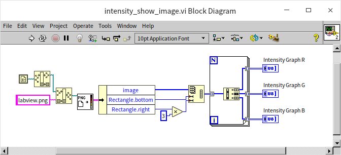
The output of the program is shown below, displaying the red, green, and blue channels of the image data on intensity graphs:
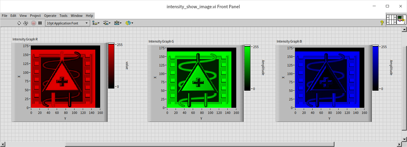
The coordinate system of the image differs slightly from the two-dimensional graphic control system used in LabVIEW. Most LabVIEW graphic controls utilize the standard Cartesian coordinate system, with the origin at the lower left corner, extending rightwards as the positive X-axis, and upwards as the positive Y-axis. Conversely, images typically start counting from the upper left corner, extending rightwards for the positive X-axis, and downwards for the positive Y-axis. This example program does not adjust the orientation of the input data, resulting in the image displayed on the LabVIEW intensity graph being rotated by 90 degrees. This can be compared with the original picture:
3D Graph Control
The limitation of the intensity graph control in handling multi-channel data stems from its inherent two-dimensional nature. When multiple channels of data are displayed simultaneously, the image from one channel would obscure the images from others, hence it's restricted to displaying one channel at a time. Additionally, the human eye's sensitivity to color and brightness nuances is significantly less than its sensitivity to spatial differences. To address this and offer a more nuanced view of three-dimensional data, LabVIEW provides specialized three-dimensional image display controls. These controls can handle multi-channel three-dimensional data effectively. Despite the display screen being two-dimensional, the controls allow for adjustments in the viewing angle of the three-dimensional image. This feature is particularly useful in three-dimensional space where certain data may obscure other data; by adjusting the viewing angle, previously obscured data can be viewed clearly.
While LabVIEW's control selection board features a variety of three-dimensional controls, they essentially utilize the same underlying control mechanism for display purposes. The primary difference lies in the specific data processing functions employed. When these controls are dragged onto the front panel, a corresponding sub VI, typically named "xx helper", is automatically added to the program block diagram. These helper VIs are instrumental in constructing three-dimensional images. Each has a specific role: some are designed to plot discrete points, others to connect points into lines, and some to form surfaces by connecting points. This versatility enables users to choose the appropriate method for their specific three-dimensional data visualization needs.
3D Point Graph
Creating a point graph in three-dimensional space shares similarities with plotting a point graph on an XY graph. The primary requirement is to provide the coordinates for each point to be plotted. Previously, we plotted height and weight data on an XY graph control and observed that the data distributions for men and women had overlapping areas, making it challenging to distinguish gender-specific data in these regions. To effectively segregate the two datasets, we can introduce gender as a third dimension (for instance, representing women with 0.1 and men with 0.2). This approach assigns three-dimensional values to each data point: height, weight, and gender. By feeding these three-dimensional values into a three-dimensional control, we can plot the data distribution in a three-dimensional space:
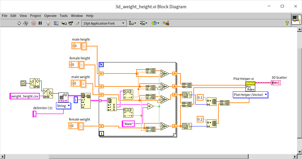
Upon running the program, the resulting visualization appears as follows. Now, by manipulating the three-dimensional graph and switching viewing angles, we can clearly observe the data from multiple perspectives, offering a more comprehensive understanding of the distribution:
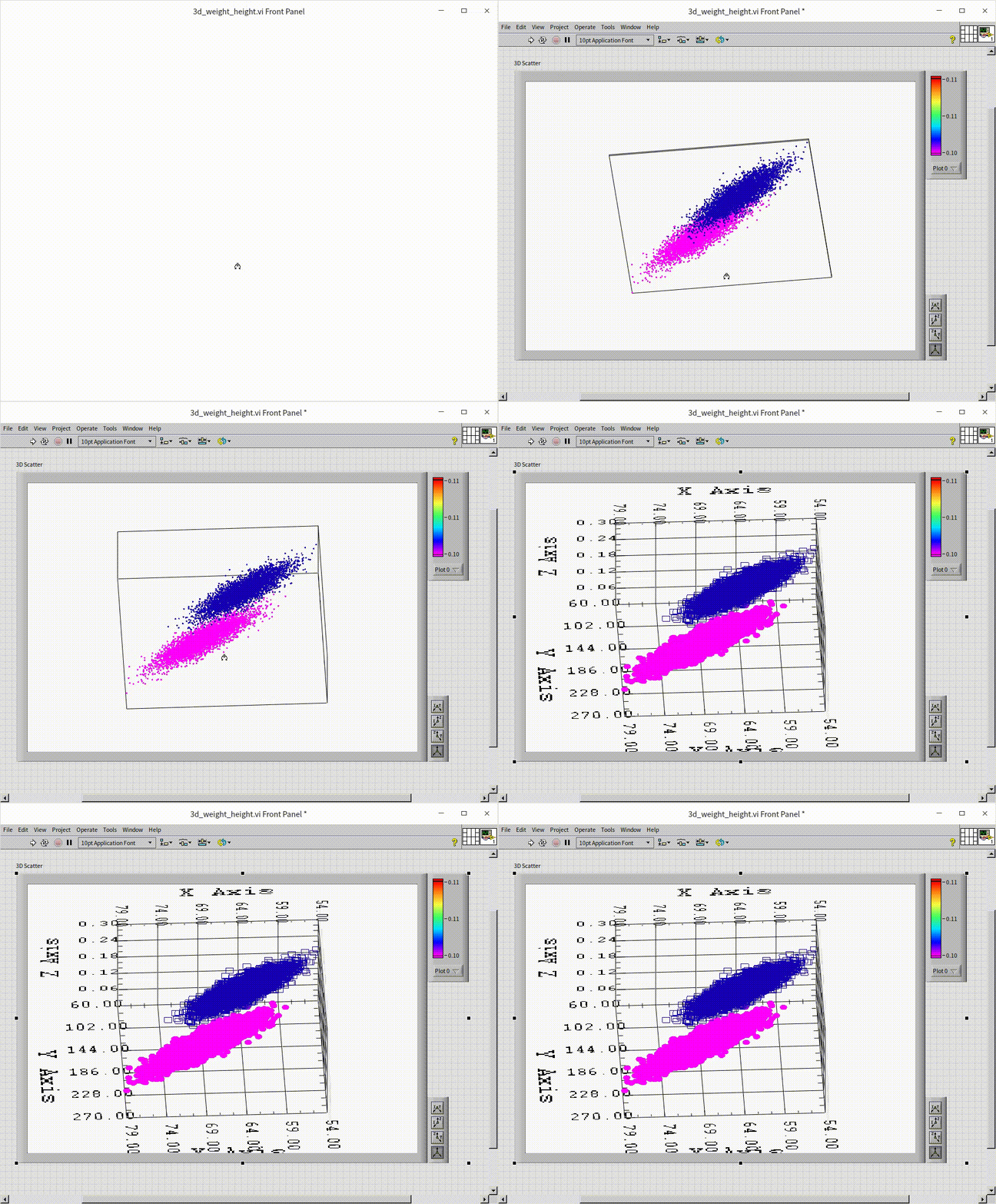
This enhanced visualization technique allows for a more nuanced and detailed examination of the data, particularly useful in areas where traditional two-dimensional graphs fall short.
3D Curve
The process of drawing a three-dimensional curve is largely similar to that of plotting a three-dimensional point graph. The main distinction lies in how the data is visualized: in a 3D curve, line segments are used to connect each adjacent point in the dataset, creating a continuous curve. While few oscilloscopes have the capability to render Lissajous curves in three-dimensional space across three channels, this functionality can be readily achieved through programming. The program illustrated below closely resembles that used for drawing two-dimensional Lissajous curves, with the addition of an extra channel. This modification results in three channels of sine wave signals, each with distinct frequencies: 2Hz, 3Hz, and 4Hz:
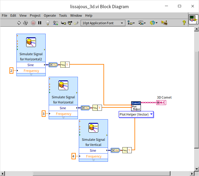
The output of this program is demonstrated in the following visualization:
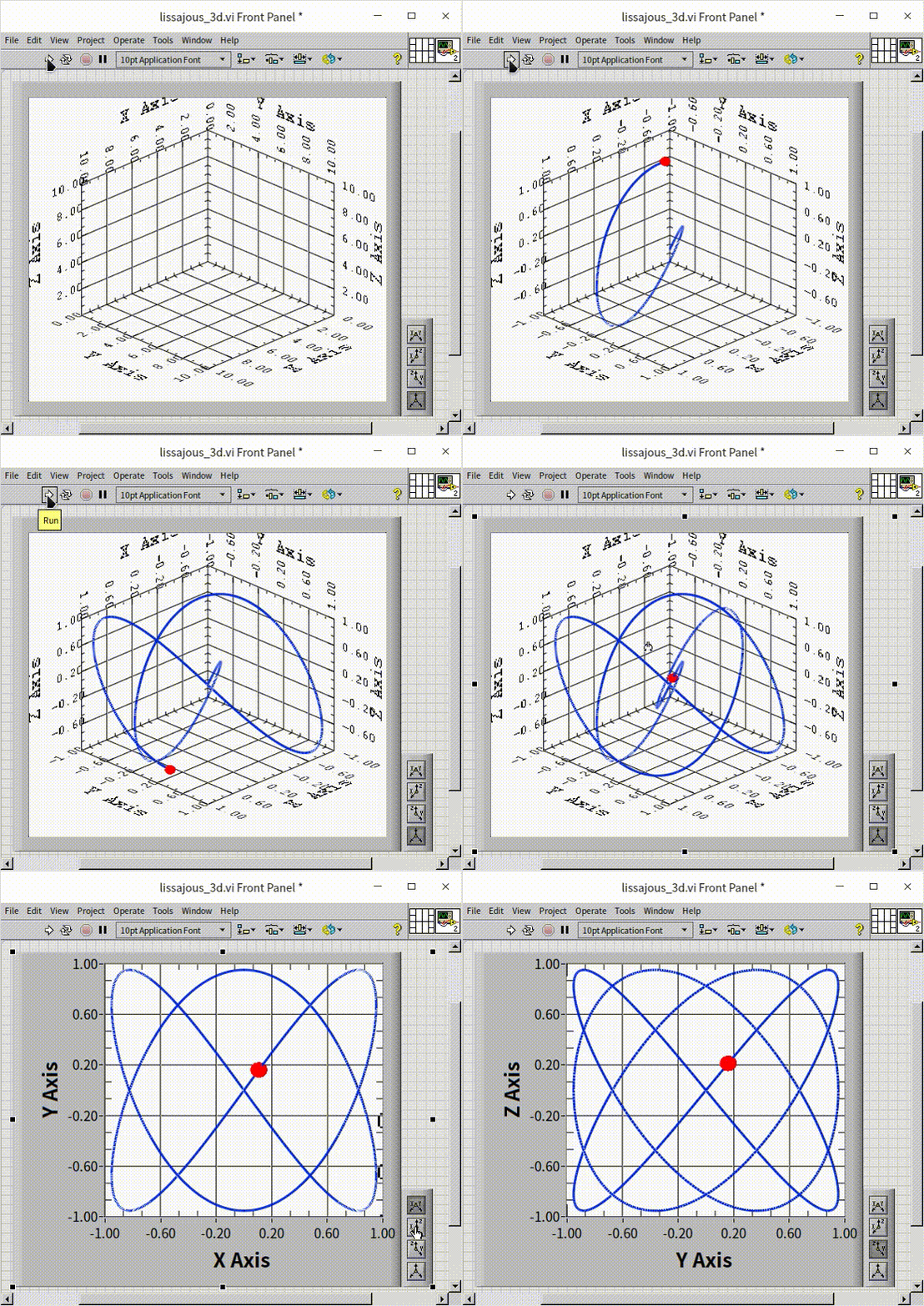
This approach allows for a more dynamic and comprehensive representation of the data, showcasing the intricate relationships and patterns that emerge when extending into the third dimension. The visual result is not only informative but can also be aesthetically compelling, revealing the beauty inherent in complex data relationships.
3D Surface
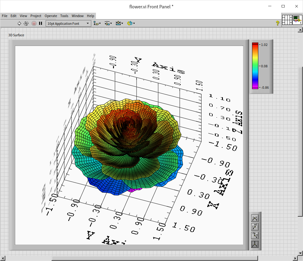
Mathematical formulas, when visualized, can beautifully encapsulate the elegance of mathematics. Take, for instance, the program below, which the author developed based on an internet-sourced formula for generating petal-like shapes. Upon completion, the program's block diagram was organized using an auto-arrangement tool. While this made the layout tidier, it inadvertently rendered the program's logic somewhat more challenging to decipher. The method of connecting programming nodes may not be the most effective for representing intricate mathematical formulas. In such cases, utilizing the formula node could be a more suitable approach:
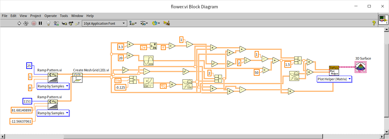
The program's output is quite aesthetically pleasing, albeit with an overly mechanical appearance, lacking realism:
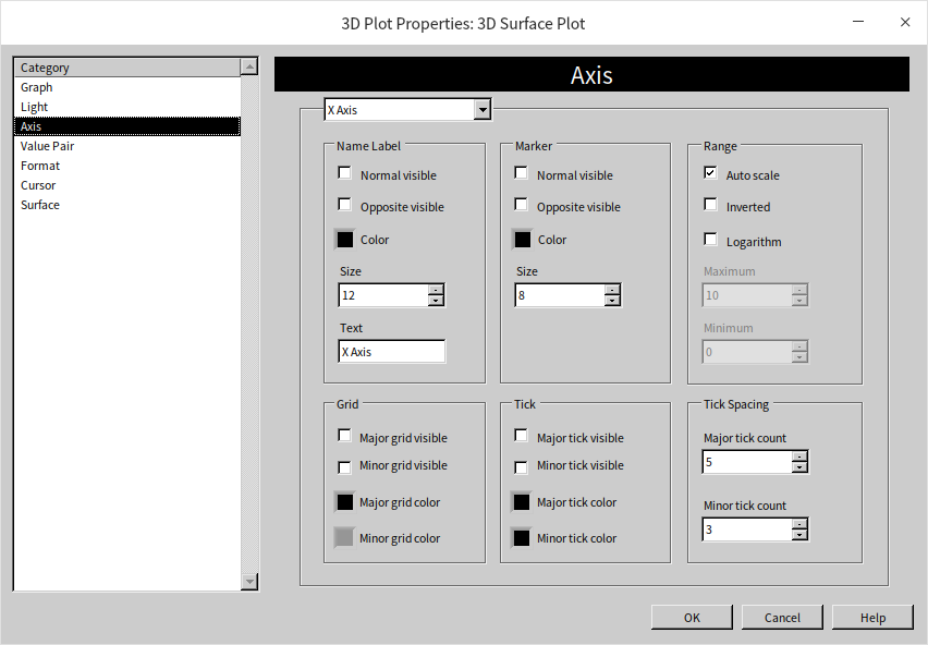
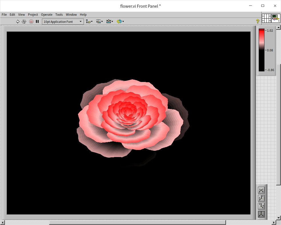
Adjusting the settings of the three-dimensional graphic control can enhance the visualization. By hiding the coordinate display and tweaking the lighting and color settings, the image can be made more visually appealing:
With these modifications, the final result more closely resembles a real flower:
Practice Exercise
- Write a VI (to generate square wave data and display these square waves on a user interface. Consider the parameters that influence a square wave, such as frequency and amplitude, and how these can be dynamically adjusted within the VI for a range of wave patterns.