UI Design Examples
Even though numerous principles and standards for interface design have already been discussed, actual interface design remains highly adaptable, with multiple potential designs for a single functionality.
To delve deeper into various methods used in interface design, let's take designing the interface for a Reversi game as an example, introducing specific techniques that can streamline the design process and enhance aesthetics. The Reversi game was chosen due to its engaging nature and relatively simple interface, making it an ideal teaching example. The game board consists of an 8x8 grid with pieces in two colors, black and white, placed within the squares. The game rules can be easily found online.
Creating such an interface can employ different approaches. Here, we'll demonstrate several methods, ranging from straightforward to more complex.
Utilizing LabVIEW's Built-in Controls
The first step in interface design should always be to consider using or adapting existing controls wherever possible. Leveraging available controls can significantly shorten development time. For this game, standard interface elements like buttons and text boxes can utilize LabVIEW's built-in controls. For the Reversi pieces and board, one might explore online resources to see if any pre-made controls are available for use.
If no ready-made controls fit the bill, then custom creation becomes necessary. Often, even if no complete solutions are readily available, breaking down the component into smaller, basic parts might reveal that existing controls can be repurposed effectively.
Consider the game pieces, for example: the pieces are circular and only come in two colors, black and white, with a maximum of 64 pieces on the board. This characteristic makes LabVIEW's circular LED controls, which resemble LED bulbs, a suitable choice for representing the pieces:

To make it look more like a real game piece, some adjustments are needed: increase its size; use the color paint tool from the tools palette to set its colors in "true" and "false" states to black and white, respectively; give it a meaningful label like "chess0", and hide the label on the front panel, since the label name is for later programming use. The enhanced appearance of the game piece is shown in the image below:

For Reversi, a total of 64 pieces are required, arranged in 8 rows by 8 columns. To create additional pieces, use the first piece as a template to copy and replicate. By selecting two pieces and copying them, you create four; repeating this process allows you to generate 8, 16, 32, and finally 64 pieces, as shown in the following image:

Next, these pieces need to be arranged neatly. Utilize the "Align Objects", "Distribute Objects", and "Resize Objects" tools from the toolbar for quick organization. First, use the alignment tool to align the first row and column of pieces, then adjust their spacing to be even. Subsequently, align the remaining pieces with the first row and column. The arranged interface is shown below:

With the interface part for the pieces fully designed, it's necessary to move on to the programming code that will handle the dynamic changes of pieces during gameplay.
Implementing Code for Runtime Interface Changes
The 64 pieces aren't always visible on the screen. At the beginning of the game, only four pieces are displayed, with each move adding one more piece. Each control in LabVIEW has a "Visible" property to control whether it should be shown on the front panel. For board positions without a piece, the corresponding piece control can be hidden. This is achieved through a simple operation of setting the control's property:
When designing interfaces, it's not uncommon to need certain controls to appear only under specific conditions and to be hidden otherwise. There are a few popular solutions to address this challenge.
One method, as previously discussed, involves toggling the visibility attribute of a control. You can set this attribute to "false" when the control is not needed, effectively hiding it, and back to "true" when you need the control to be visible. This tactic works well with a small number of controls and is straightforward to implement in code. However, it can complicate interface editing and debugging since controls might be hidden when the program is stopped, necessitating their location and visibility adjustment before any edits. Furthermore, this method becomes cumbersome when you have to manage multiple controls that need to be displayed in the same area at different times. Overlapping controls in one location can hinder editing due to some controls being obscured by others.
Another strategy involves manipulating the "Position" property of a control to dictate its placement on the interface. To make a control visible, you position it in its intended spot; to hide it, you move it outside the visible area of the VI front panel. For instance, if the VI front panel's display area measures 500×400, moving the control to a position off-screen, say at 100×600, ensures it won't be visible during the program's runtime. This control can later be located and edited by scrolling through the VI front panel.
This approach guarantees that controls can always be located on the VI front panel for modifications, no matter their state of visibility. However, it necessitates meticulous planning of control coordinates and involves more elaborate programming.
For scenarios where a group of controls needs to be simultaneously visible or hidden, employing a tab control can be effective. Adding the group of controls to a specific tab and changing the displayed tab page allows you to control the visibility of these controls. Making the tab control transparent enables even more flexible visibility management. Wizard-style interfaces, which are fairly common, offer a sequential user experience where navigating through "Next" or "Back" buttons unveils new content. Such interfaces are ideally suited for tab controls, with each tab representing a step in the wizard process. Navigating through "Next" or "Back" effectively changes the tab page.
Coming back to the Reversi game program, opening its block diagram reveals a neatly organized array of 64 control terminals:

To individually manipulate the 64 control terminals would make the program code overly complex and challenging to understand. To make the program more straightforward, these 64 controls, corresponding to their positions on the chessboard, can be organized into an 8x8 two-dimensional array. This approach makes it clear which chess piece each operation affects.
Directly assembling them into an array involves creating a reference for each control and then using an array creation function to organize them. However, manually handling 64 controls is quite cumbersome. Fortunately, this process can be simplified through programming. Given the systematic naming of these 64 chess pieces, the program shown below can sequentially obtain references for these controls by name and then convert these references into an 8x8 array.

This segment features a sub-VI named "Get Control.vi" designed to fetch a control's reference using its name. Numerous methods exist for obtaining a control's reference, but since this VI is readily available in LabVIEW (located at [LabVIEW]\resource\importtools\Common\VI Scripting\VI\Front Panel\Method\Get Control.vi), it is conveniently used here.
The output, "chess array", is an 8x8 array containing references to all 64 controls. In future operations involving chess pieces, the corresponding piece's reference can be easily obtained from the array.
In practice, when designing more complex interfaces that require manipulating multiple controls' properties in a sub-VI, all these control references need to be passed to the sub-VI. A simple and intuitive solution is to create references for the main VI's controls at the program's start, bundle these references into a cluster, and then pass this cluster to the sub-VI. Using a cluster significantly reduces the number of wires on the block diagram due to the large number of controls.
However, this method's downside is clear. Any modification to the interface, such as adding, removing, or changing a control, necessitates adjustments to the cluster containing all control references. Consequently, all VIs that utilize this cluster might also need to be modified, which is quite inconvenient. Thus, the program could alternatively use the strategy described earlier with the "Get Control.vi" sub-VI, passing only the main VI's reference to the sub-VI. When a specific control from the main VI is required, its reference can be obtained by name for operation, streamlining the process.
Adding Decorations and Background Images
Once the chess pieces are placed, it's time to add the chessboard. Since the board is static, its design is straightforward. LabVIEW comes with various decorative components like lines and squares available in the "Modern -> Decorations" control palette:

Using these decorative elements, you can easily create a chessboard. The image below shows a partial chessboard made with several black lines.

Decorations are most commonly used in interface design to group related controls together or to separate unrelated ones.
If simple shapes from LabVIEW don't achieve the desired aesthetic for the chessboard, consider designing an intricate chessboard with a professional drawing tool or Paint and saving it as an image file. Then, place this image on the VI's front panel as a background image for a more visually appealing board.
To add an image to the VI front panel, you can use Ctrl+C, Ctrl+V to copy and paste; alternatively, drag and drop the image file from a file browser directly onto the panel. The dragged image will appear on the top layer, obscuring the chess pieces. Use the "Reorder" tool on the front panel toolbar and select "Move to Back" to position it behind the pieces. Once the chess pieces and board are adjusted, as shown below, the interface for the chess pieces and board is ready.

The chessboard and pieces need to have a fixed relative position. By selecting the board and all pieces, then choosing "Group" from the "Reorder" tool, they are set as a group. This action fixes their relative positions, allowing them to be moved together on the interface. Selecting "Lock" completely secures the chosen controls in place, making them immovable.
The image used here is rectangular, but there might be times when an irregularly shaped background is needed. This can be achieved by using an image format that supports transparency, such as GIF, by setting the blank parts of the image to transparent. PNG format, which supports pixel transparency, can create effects like shadows. For instance, the VI below includes two pink boxes with shadow effects, created using PNG format images.

During development, interface dimensions may change, and directly pasted images, being of fixed size, may not suit as background images. By setting the properties of the front panel pane, however, you can cover the entire front panel with a selected background image. Right-click the scroll bar of the front panel window, choose "Properties", and in the "Background" settings, select or add an image to use as the background on the VI's front panel. The effect of selecting the "Clouds" background is shown below.

Creating Custom User Controls
Now that the chessboard is set up nicely, the chess pieces still resemble light bulbs. Creating custom controls allows for a design that makes the pieces look more like real chess pieces.
A significant factor affecting the appearance of a chess piece is the surrounding glow effect, which can be removed for a more authentic look. By right-clicking on a chess piece and following the steps for creating custom user controls, you can delete the outer white border. After editing and saving, the new chess piece will no longer have a border. Interestingly, for these "chess pieces", there's a simpler method to remove the glow effect: uncheck the "Decal" option in the "Display Items" context menu:

To further enhance the custom control with a professional appearance, one might need to create sophisticated images using professional graphic design tools and then apply these images to the control. The image below showcases a chess piece button created with professional image editing software, complete with a shadow effect.

All controls can opt for a Strict Type Definition. Any future modifications made to the control within the strict type definition (.ctl file) will be reflected across all instances of that custom control used in the interface.
Refining the Interface Implementation
At this point, the interface for the chessboard and pieces is essentially ready. Let's draft a brief code segment to evaluate this interface design, assessing its feasibility and potential for refinement.
Consider the chessboard initialization as an example. At the start of the game, there are only four pieces: two black and two white, positioned at the board's center. The code for this setup is shown below:

The outcome of its execution is depicted here:

In the example provided, the sub VI named Get All Chess.vi is tasked with obtaining references to all the chess pieces and organizing them into an 8x8 two-dimensional array.
While this approach isn't overly complex, it does highlight some inefficiencies. The chessboard layout requires two arrays for a clear depiction, which unnecessarily complicates the programming effort. The fundamental issue here is that each chessboard position could embody one of three states: black, white, or empty. However, the lightbulb control only toggles between two states: on or off. These binary states don't fully encapsulate the chess pieces' conditions, necessitating the use of the control's visibility attribute. Thus, two Boolean arrays are needed to accurately define the status of a chess piece.
Moreover, pinpointing the exact board position of a mouse click becomes a cumbersome task. The program can only capture the mouse's position relative to the VI front panel's top-left corner. Should the board's position shift, the code calculating the mouse click's location would require corresponding adjustments.
To address these challenges, an improved solution involves using a control capable of representing more than two states for the chess pieces. In this case, the "Classic -> Classic List and Enum -> Picture Ring" control could be employed. This control is set up with three options: an empty picture, a black chess piece picture, and a white chess piece picture:

The chess pieces utilize PNG format for their images to achieve transparency and shadow effects.
To ensure the Picture Ring control seamlessly blends into the board without visible borders or backgrounds, these elements can be set to transparent using a transparent paint tool:

Despite the board's appearance of being empty of chess pieces, the mere presence of the Picture Ring control enables the detection of user moves through the control's mouse click events.
Nonetheless, the initial design's significant flaw lies in treating each chess piece as an independent control, leading to an overly complex and difficult-to-manage interface. For more intricate games like Go, this method would result in an unmanageable interface with nearly 400 controls.
A streamlined solution leverages array controls, grouping the Picture Ring controls with chess piece images into an array. A two-dimensional array is created to house the chess piece elements. To make certain interface elements like array borders and backgrounds invisible, they can also be set to transparent with a transparent paintbrush. The array's label and index display can be hidden through the array's right-click menu "Visible Items -> Index Display":

By arranging the chess piece elements within the array and resizing it to an 8x8 grid to overlay the chessboard, a singular chess piece control is crafted. This method greatly simplifies the coding complexity. For instance, initializing the board now requires merely a single assignment statement:

Utilizing Drawing Controls
At times, a program may require the creation of complex graphics or curves that are not readily available within LabVIEW's control repertoire. Nevertheless, it's possible to leverage existing LabVIEW controls with supplemental coding to craft controls that serve specific functionalities.
Commonly utilized as foundational elements for such bespoke functionalities are the XY Graph, 3D Picture Control, and Picture Control. For instance, to draw polar coordinate function curves, one could adapt the XY Graph. By developing a VI that translates polar coordinates into Cartesian coordinates for plotting on an XY Graph, the desired outcome can be achieved. Similarly, if there's a need for a control that supports a specific 3D drawing technique, modifying the 3D Picture Control could provide a solution.
The Picture Control stands out as a fundamental component capable of producing numerous unique interface effects. Whether it's crafting a menu with icons or emulating the LabVIEW function palette, the Picture Control can be instrumental despite the absence of ready-made controls for these purposes in LabVIEW. The chessboard and pieces interface previously discussed can also be realized using the Picture Control.
Below is the detailed procedure for implementing such an interface.
First step: Initiate with a blank Picture Control:

Operations commonly associated with the Picture Control are found under "Programming -> Graphics & Sound -> Picture Functions". The functionalities for reading and writing graphic files are located under "Programming -> Graphics & Sound -> Graphics Formats":

Contrary to methods introduced prior, constructing a chessboard and pieces with the Picture Control does not occur within the VI editing phase but requires drawing during the program's execution. Hence, the interface design tasks outlined must be executed through programming.
The Picture Control possesses a "Clear Picture Before Drawing" attribute, offering three options:
0: "Never erase" signifies that each data transmission to this control, like a ring pattern, gets superimposed over the original content, accumulating graphical elements. If aiming to construct a pattern with three rectangles, this can be accomplished incrementally, each step adding to the composite image.
2: "Erase every time" ensures the Picture Control clears previous graphics with each new submission, maintaining only the latest drawing. This action resets the background to default white, potentially causing flickering observed by users during updates. This method is best avoided unless necessary.
1: "Erase on first run" effectively initializes the canvas at the program's commencement, laying the groundwork for subsequent selective updates rather than a complete redraw with every modification.

Creating the chessboard is the first step, as it forms the backdrop for the pieces. While drawing the chessboard could involve using LabVIEW's line drawing function to meticulously craft it line by line, we already have an image of the chessboard, which allows us to simply display this image directly. The code is illustrated below:

LabVIEW natively supports only bmp, jpg, and png image formats. If you need to open a file in another format, such as a gif, you must first convert it into a format LabVIEW recognizes using other professional tools, before using it within LabVIEW.

The next step is to add the initial four chess pieces to the board. The process for drawing the pieces follows the same principle as that for the board. You could use the circle drawing function, or employ pre-made images. The program's block diagram is as follows:

The effect upon execution:

To this point, we've explored various methods for designing the chessboard interface. Ideally, if one could extract and combine the relevant interfaces and functionalities of this Othello game (such as placing and flipping pieces) into a modular component for release, it would enable others with similar requirements to leverage this component without the need to redevelop it.
However, prior to LabVIEW 8, achieving such functionality was challenging. The code controlling the pieces' behaviors was dispersed throughout various parts of the program, and both the chessboard and pieces were integral components of the main VI, complicating their extraction into an independent module. With the introduction of XControl in LabVIEW 8, it became feasible to encapsulate both the interface and behavior of a control into a comprehensive component. This component could include both the interface and operational code, making it a self-contained entity. We will delve into how to craft an independently distributable component in the XControl section in detail.
Special Interface Effects
Transparency Effect
Some programs, like certain MP3 players, can run in the foreground on your desktop. To prevent them from blocking the view of other windows, these programs can be set to a translucent state while operating. This allows you to see through them to the windows behind.
LabVIEW-created interfaces can achieve this effect as well. By going to the VI properties and selecting the Window Appearance page, then clicking the "Custom" button, you enter the "Custom Window Appearance" page. Here, there's an option to set the transparency of the VI's front panel during runtime, making the interface translucent:

This attribute can also dynamically change during runtime. The VI's properties "Front Panel Window -> Run VI Transparently" (FP:RunTransparently) and "Front Panel Window -> Transparency" (FP:Transparency) are used to enable transparency and adjust its level, respectively. The image below shows a program that dynamically changes this property and its effect: the VI front panel becomes translucent during runtime, allowing you to see the block diagram behind it:

Irregular Shapes
Some application interfaces require a non-rectangular, unique shape. This style is most commonly seen in media player software, where the "skin changing" feature allows the interface to appear in various non-standard shapes.
LabVIEW programs can also achieve such effects. However, this capability is not directly provided by LabVIEW; it's a feature of the Windows API. LabVIEW needs to call a few simple Windows API functions to achieve these effects.
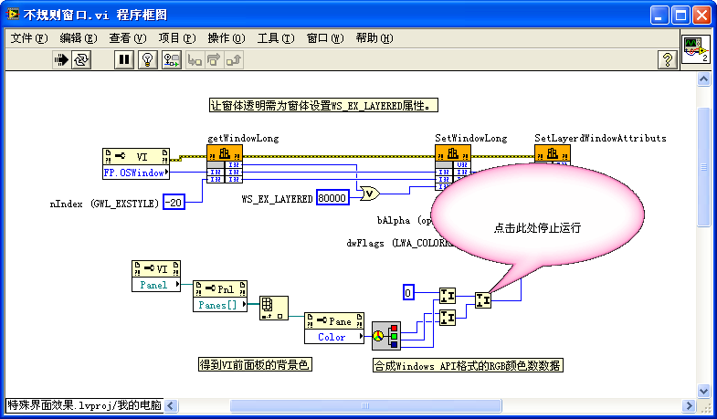
To create an irregular interface, first place an irregular graphic on the interface, then call Windows API functions to make the interface's background transparent. This results in a uniquely shaped interface. The program for accomplishing this is shown below:

In this program, three Windows API functions are utilized: GetWindowLong, SetWindowLong, and SetLayeredWindowAttributes. The first two functions adjust window properties to allow the window to become transparent. The last function sets specific color areas within the window to transparent. In this instance, areas of the VI's front panel with the default background color are made transparent. It's crucial to note that LabVIEW's RGB color data format differs slightly from that used by the Windows API due to LabVIEW's high-bit data storage method, necessitating a conversion.
Moreover, to ensure that only the distinct irregular-shaped graphic is visible during the program's execution, the VI properties' window appearance settings should remove the title bar, scroll bars, etc.:

Before running the program, the function's front panel looks like this: The VI's front panel displays a bubble-like pink graphic.

After the program is executed, only the pink bubble portion of the VI's front panel remains visible. The rest becomes transparent, allowing the VI's block diagram behind it to be seen:
Animation
For displaying complex animations in LabVIEW, invoking other shared libraries or ActiveX controls is an option. This includes creating 3D animations with the OpenGL library or playing Flash animations. For simpler animations, basic LabVIEW programming techniques suffice. Essentially, simple animations are just a series of static images displayed consecutively. Here are two straightforward methods:
- For animations involving a control moving, enlarging, or shrinking on the screen, adjusting the control's position, size, and other attributes can achieve the desired effect.
- More intricate effects can be attained using an image control to draw a series of images consecutively, creating an animated appearance.
For instance, to produce an endlessly rotating wheel, first, create a series of images depicting the wheel at various rotation angles. Sequentially displaying these images simulates the wheel's rotation. The following image showcases an image ring control populated with images of the wheel at different angles. Continuously incrementing this control's value in the program simulates the wheel's rotation:

Furthermore, adjusting the control's position not only allows the wheel to rotate but also to move, simulating the wheel's forward roll:

Coupled with the previously discussed method for creating irregular interfaces, this approach can ultimately simulate a wheel rolling across the screen:
